Category Archives: Research

How Limitations of the Medium Influenced Video Game Art

The history of video game graphics is relatively short spanning just 57 years (Brown, 2015). In the eyes of film or photography, games are still in their infancy. However, video games have dramatically developed in this short amount of time both graphically and as a form of entertainment.

They have developed from simple mechanics displayed with moving light…

Tennis_For_Two_on_a_DuMont_Lab_Oscilloscope_Type_304-A

Tennis For Two, heralded as the grandfather of video games, was developed in 1958 on an analogue computer using a cathode-ray tube and oscilloscope to display the game.

…to photorealistic 3D characters and worlds.

Hellblade-Life-Like

Hellblade, currently still in development, uses detailed 3D scanning in combination with modelling and texturing to create realistic graphics.

Because of the medium itself, video game art is constrained by graphical capacity and hardware limitations. Due to this, game art tends to change and adapt with technological advancements. However, some styles maintain popularity over time.

RogueLegacy

Rogue Legacy (2013) utilises 2D pixel sprites in a randomly generated play space.

To see how video game art has adapted and changed over time, and how this influences current practices, we must go back to the beginning.

IN THE BEGINNING…

In the early days of video games, the graphics were extremely limited. During the early 1970’s, games were limited to simple shapes and a polar palette of black and white (Brown, 2015; C.L., 2011).

tsp-pong

Pong (1972) is a famous example of this.

The ‘art’ was merely a representation of the vague narrative given to the game’s mechanics. In this sense, game art of this era was about maximum communication with minimum graphics.

SKInvadersScreenshot

Space Invaders (1978) uses slightly more complicated images.

The limitations of black and white prevented detailed game art at this time. It wasn’t till the late 70’s that development of arcade hardware allowed for colour (Brown, 2015; C.L., 2011).

arcade_classics_galaxian_screen05

Although not the first, Galaxian (1979) was considered the first successful game to use colour.

This allowed for multi-coloured sprites, providing artists with a larger range of tools and allowing for more detailed games. By the 1980’s, coloured pixel graphics were considered the norm (Brown, 2015). Although vector graphics were used for some games, the ability of pixels to render complex scenes with detailed, filled shapes secured their dominance (Brown, 2015).

ast_scrshot_1024x768

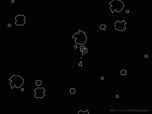
Asteroids (1979) is probably the most famous vector graphics game.

During the 80’s, the majority of video games were using 2D coloured sprites to depict characters and enemies (Brown, 2015). As the hardware developed beyond 8-bit, so too did the complexity of the graphics. However, game art was still about working with or around the limitations of the hardware to convey enough information to the player (Brown, 2015). Due to this, characters were created with simple, bold designs and limited movement (Cobbett,2009). Characters often had only a few sets of animation with little to no follow through or anticipation.

89885f5afec93f80cf5c6cf95debbdee

Mario (1985) famously wears a hair because his hair was too hard to animate.

Over the course of the 80’s, more colours became available to artists and sprites became more detailed and complex (C.L., 2011). As hardware capabilities increased, games were able to have more detailed environments and backgrounds (Brown, 2015). This allowed artists to develop complete worlds with distinct aesthetics.

20070804165334!Golden_Axe_(DOS)

Golden Axe (1989) featured detailed characters and environments with an isometric view, allowing the player to move in four directions.

Towards the end of the 80’s and, through the early 90’s, some developers began the awkward transition into 3D graphics. In these early days, 3D graphics were limited to wireframe rendering (Corbett, 2009). Much like the early days of game, artists were forced to reduce complexity and favour communication through simple forms.

elite_c64_anflug

Elite (1984) is considered a pioneer of 3D with its wireframe visuals.

Graphic capability eventually improved beyond wireframe, allowing 3D models to have flat shading, but it was considered ugly compared to the detailed 2D graphics at the time.

street

With stunning graphics, detailed characters and a wide variety of animation, Street Fighter II (1991) still holds up today and secured the ongoing popularity of 2D fighting games.

Similarly, during the 90’s, 2D games were experimenting with multimedia technology like digitised sprites and full motion video (Corbett, 2009). Digitised sprites were considered a new wave by some and became popular thanks to games like Mortal Kombat (Brown, 2015). However, full motion video, due to compression and resolution limitations, was quickly dropped.

image04

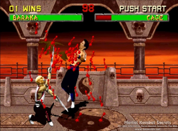
Mortal Kombat (1992) featured ‘realistic’ graphics and gore, causing the controversy that lead to its success.

Despite its general ugliness, 3D was quickly becoming popular but the hardware was not up to scratch (Brown, 2015). To compensate, many games incorporated 2D sprites in a 3D world.

Doom

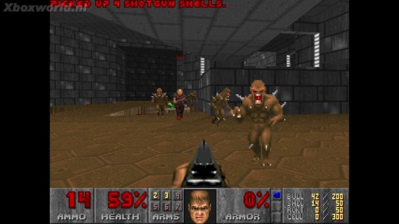
With a 3D environment, 3D lighting and 2D sprites, Doom (1993) was extremely impressive at the time and paved the way for first-person shooters as we know them.

This paved the way for the next era of game art.

TRUE 3D

From the mid to late 90’s, hardware developed enough to allow fully 3D games to be developed. This provided another change and challenge for artists: the characters, animations and environments must look good from all angles and in extremely low poly (Brown, 2015).

KoopatheQuickSuperMario64

Mario 64 (1996) maintains a pleasing aesthetic and considered a pioneer of true 3D.

Another consideration that artists and animators had to make, was the reaction and speed of the animations (Brown, 2015). As fast-paced first person shooters rose in popularity, consumers were expecting believable yet fast actions. Artists had to compensate believability and anticipation for reactivity of animations.

Quake1_782713243

Heralded as the first true 3D first person shooter Quake, (1996), was critically acclaimed at the time.

As 3D games became dominant, two distinct streams emerged: realistic and stylised (Brown, 2015).

REALISM VS. STYLISED

Regardless of aesthetic, realism is often toted as the best (Brown, 2015). This is not always true. In fact, when looking back at older games, those with ‘realistic’ graphics (at the time) feel outdated and often fall into the uncanny valley.

Seaman

Seaman (1999) is a virtual pet game and potentially the creepiest game known to man.

In reaction to this, a lot of games were created with stylised graphics. This was often done through use of cell shading and stylised or ‘cartoony’ characters.

6790143976_c87e63f86c_b

Jet Set Radio (2000) used cell shading and bright colours to create a stylised aesthetic.

Currently, we can produce extreme realism in terms of visuals, lighting and physics.

rottr3-deadly-tombs

The latest Tomb Raider (2015) features realistic hair simulation rendered in real-time.

While video game art is still bound by graphical and hardware limitations, it is no longer forced to have maximum communication for minimum visuals (Corbett, 2009).

CURRENT PRACTICES: REALISM

So how does this long, detailed and well researched history influence the current practices for creating realistic video game art?

Well, as mentioned before, video games do not have the same limitations that they once had. For realistic games, we face a new issue. Games need to feel realistic: players will expect everything from reload animations, dynamic grass simulation and varied action, hit and death animations. Additionally, they will want reactivity and speed, which sometimes opposes the realism.

Assassin’s Creed games are renowned for detailed and varied parkour movement.

While this is achievable it might be well out of scope, forcing the artists and developers to find ways to cheat or work around this. This has changed the way the art and animation is created within the industry.

One method that artists use to create diverse environments quickly and efficiently, is through modular development of assets:

Workflow06
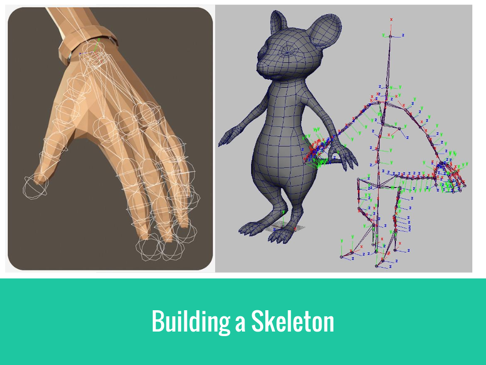
In order to achieve ‘true realism’ many companies have begun using motion capture as a more efficient way to get realistic animation (Dahl, 2015).

3D-animation-motion-capture

Motion capture for The Last of Us (2013).

And even facial motion capture for subtle expressions.

02Other methods, such as digital scanning, are being used to achieve photo realistic 3D models (Ninja Theory, 2015).

Capture

Body scan for Hellblade (still in development).

While polygon count is still an issue, it is no longer the major limiting factor. Models too detailed to be featured in the game can be baked out at a normal map and projected onto a lower poly model (Ward, 2013).

266963_367010970057889_1979841288_oAdditionally, extreme texture detail can be achieved with the help of software such as the Quixel Suite.

maxresdefault2The development of realistic games is always tied to technology and will continue to be so. The future of game art will depend on the next leap or trend of video games themselves.

CURRENT PRACTICES: STYLISED

Many current games are preferring to employ a stylised aesthetic. This might be due to a multitude of factors:

  • To avoid the bleeding edge and eventual aging of realism
  • To be able to run on portable devices such as mobile
  • To stay within a smaller, indie budget
  • To have a particular art style
  • Because it suits the game better

The current popularity in indie or ‘retro-like’ games has seen a rise in 2D stylised graphics.

unnamed

VVVVV (2010) is a critically acclaimed pixel puzzle platformer.

Current technology allows these sorts of games to run a lighting fast speeds. Thus giving them a competitive edge on their realistic peers.

skullgirls_04

Skullgirls (2012), a fast-paced fighting game, uses beautiful, 2D animation.

Additionally, lessons from the history of games allow these to be created with a high degree of fidelity and a modern understanding of game design (Brown, 2015).

fez

FEZ (2012) allows players to move in 3D with a ‘2D’ pixel aesthetic.

Similarly, some games break the mould and experiment with new forms of stylisation.

UBEV01Q

Called ‘1-Bit’ or ‘dither-punk’, Return to the Obra Dinn (in development) returns to a monochromatic style with 3D graphics.

This is an exciting era of video games. The indie development scene currently gains as much attention as AAA titles and there is a balance between realistic and stylised games.

I don’t know where video game art with venture to next but I am happy to be along for the journey.

REFERENCES

Brown, S. (2015). A Brief History of Graphics [Video]. Retrieved from
www.youtube.com/watch?v=QyjyWUrHsFc

C.L. (2011). The Colourful History of Video Games. Retrieved from
http://visual.ly/colorful-history-video-game-animation

Cobbett, R. (2009). The Evolution of Gaming Graphics. Retrieved from
http://www.techradar.com/au/news/gaming/the-evolution-of-gaming-graphics-609050

Dahl, T. (2015). Action: The Animator’s Process [Video]. Retrieved from
http://livestream.com/gnomon/action/videos/88740187

Masters, M. (2014). From the 80’s to Now: The Evolution of Animation in Video Games. Retrieved from
http://blog.digitaltutors.com/80s-now-evolution-animation-video-games/

Moss, R. (2015). Lucas Pope and the rise of the 1-bit ‘dither punk’ aesthetic. Retrieved from
http://www.gamasutra.com/view/news/260368/Lucas_Pope_and_the_rise_of_the_1bit_ditherpunk_aesthetic.php

Ninja Theory. (2015). Hellblade Development Diary 17: A New Body [Video]. Retrieved from
www.youtube.com/watch?v=0FZaJ3-4A-g

Ward, A. (2011). How to create character models for games: 18 top tips. Retrieved from
http://www.creativebloq.com/how-create-character-models-games-18-top-tips-9113050

Ward, A. (2013). Game Character Creation Series. Retrieved 2nd October, 2015, from
http://cgi.tutsplus.com/series/game-character-creation-series-kila–cg-31010

The Role of Colour in Character and Scene Design

WHY IS COLOUR IMPORTANT?

According to psychological market research, colour can account for up to 60% of the acceptance or rejection of a product (Kissmetrics, 2015). In the same way, a character or scene will look thrown together or implausible if colour is not carefully considered throughout the design process. This is because colour greatly contributes to the mood and story of a piece (Price, 2014). If compelling and meaningful choices are made, colour can be used to imply a characters personality or role within the story (Diaz, 2011). To use colour effectively, we must first understand basic colour theory, the different attributes of colour and to use them harmoniously.

BASIC COLOUR OVERVIEW

Basically, all colours originate from the three primary hues: yellow, blue and red (Lovett, 1999).

primary_secondary_tertiary

Secondary colours are created by mixing two adjoining primary hues and tertiary colours are created by mixing two adjoining secondary hues (Lovett, 1999). Compound colours are mixtures of the three primary hues (browns and khakis) (Lovett, 1999).

While this is important for blending colours, even more important is understanding the different attributes of colour and how they can be used to achieve a mood, focal point or atmosphere.

THE ATTRIBUTES OF COLOUR

Hue

This is the identity of a colour separate from its saturation or value. The hue establishes whether the colour is blue, orange, green-yellow etc (CGCookie, 2013).

disk-rays

Saturation and Value

Every colour has a hue, saturation and value. Saturation refers to the intensity of a colour while value refers to how light or dark it is (Price, 2014). These can be used to guide the viewer, set the mood and tell a story.

ColourMost commonly, saturation and value can be used to create a focal point. For example, areas of high saturation draw the eye (Price, 2014). This technique is used a lot in fashion photography. As seen below, the focal point is the bright lipstick.

fashion-photography-for-Marie-Claire-8449Similarly, areas of high value contrast, that is a difference of light and dark values, become the focal point (Lovett, 1998). For example, in Howard Pyle’s Marooned, the contrast between the bright sky and the darkened figure of the pirate make him the focus point of the piece.

Marooned_(close_up)However, it is important not to overdo saturation or value. High saturation and high value contrast should be used sparingly on selected focus points. Too many saturated colours gives no focal point and becomes confusing and ugly (Price, 2014). Some cartoons or animations try to use this as a style but it can look garish.

3nogifekeyimageidAdditionally, saturation can be used to influence the mood of a piece. High saturation gives a vibrant and joyous feel while desaturated colours feel serious, dull, old and sad (Price, 214). For example, the first shot of Shanghai in Skyfall is bright and vibrant suggesting opportunity and adventure.

vlcsnap-2015-11-30-09h37m57s984While the first shot of Skyfall is desaturated and dull symbolising the old memories and ghosts the James Bond associates with the estate.

vlcsnap-2015-11-30-09h35m33s185

But how can we use this in character design?

In terms of saturation we can try to explore the characters personality. In Edward Scissorhands, Kim wears bright colours to show her vibrant, outgoing personality while Edward wears tones and even has pale makeup to demonstrate his more reserved and serious personality.

edward scissorhands53Alternatively, we could use saturation to direct of the eye of the viewer. Lilith, from Borderlands 2, wears slightly desaturated colours while her bright red hair is quite saturated. This creates a focal point on her face which her hair so nicely frames.

According to Diaz (2011) main characters should have values that make them distinctive, even in black and white. Looking at Spike from Cowboy Bebop, consider how the contrast of the yellow shirt and dark blue jacket catches the eye. This effectively frames his face, thus making it the focal point.

Spike_Spiegel_No_Background

Temperature

When looking at the colour wheel, we can cut it in half. On one side are the cool hues, on the other are the warm hues. A colour’s temperature is measured in degrees Kelvin (K) but this is more important for editing photos than for design.

eveyyiqrlhnaxwzu9fhuCooler colours give an introspective vibe (Diaz, 2011). They tend to be calm, calculating and soothing and will often receded into a scene (CGCookie, 2013). In contrast to this, warm colours have an energetic feel (Diaz, 2011). They tend to feel brighter and more vibrant and will often ‘pop’ out of a scene (CGCookie, 2013).

With this in mind, temperature can be effectively used to convey a character’s personality. Consider Miguel and Tulio from The Road to El Dorado.

307544-the-road-to-el-doradoMiguel has a warm colour palette reflecting his optimistic, outgoing personality while Tulio has a cool palette reflecting his calculating, more cynical personality.

For design, using a harmony of both cool and warm colours is highly effective (CGCookie, 2013). However, combining excessive amounts of both can make the design seem busy, chaotic and ugly (Kissmetrics, 2015). For this reason, it is good idea to pick a dominant temperature and use the other temperature as a highlight (CGCookie, 2013). For example, in a predominantly cool design, a warm colour will pop out and vice versa. This can be used to great effect when designing both characters and scenes.

For example, Aang, from Avatar: The Last Airbender, is composed of warm colours with the cool highlight of his arrow tattoo.

avatar-the-last-airbender-flyingThe warm colours reflect his sunny, outgoing personality and make the blue tattoo stand out even more. You can’t help but to notice it thus constantly reminding the viewers that Aang is the Avatar (as signified by these tattoos).

Katara_Aang_Sokka_-_The_Avatar_StateIn addition to this, Aang is the only character that has a combination of cool and warm colours (other characters have only one or the other). This again makes him stand out against the rest of the cast and positions him as the main character. Not to mention that, in the beginning of the series, the secondary characters wear cool colours to provide even more of a contrast.

COLOUR HARMONY

Colour schemes are different ways to harmony between colours within a piece. Different schemes and different levels of harmony can create different moods or feelings. Extreme harmony can make an image seem boring or flat while no harmony can seem chaotic and messy (Morton, 2015). A couple of basic schemes are explained below:

Monochromatic

A single hue is used while the value and saturation is varied (Price, 2014).

AndyWarhol-Grey-Marilyn-Monroe-1967

Analogous

Three adjacent hues (Morton, 2015). As this is frequently seen in nature, this scheme is harmonious and pleasing to the eye (Kissmetrics, 2015). It appears natural, serene and comforting (Price, 2014).

2992389-green_arrow

Complementary

Two hues on opposite sides of the wheel (Morton, 2015). As this creates maximum contrast is it good to use one as the dominant colour and the other for splashes or highlights (Kissmetrics, 2015; Price, 2014).

Disney-s-Robin-Hood-walt-disney-characters-22260111-900-547

Split Complementary

A variation of the complementary scheme (Price, 2014). Uses the two hues adjacent to one of the complementary hues (Kissmetrics, 2015). Again, this scheme has a high degree of contrast but is not as drastic as the complementary scheme. This scheme creates a joyous mood (Price, 2014).

Genie5

Triadic

A triangle of hues. This is hard to do well and can seem childish. If all three are used in equal amounts it will look chaotic and ugly (Price, 2014). It’s best to use one as a background and the others as highlights (Kissmetrics, 2015).

1231178185_super-mario-cheers

Tetradic

Also called rectangle, two sets of complementary pairs (Kissmetrics). Again, equal amounts of each will be chaotic. Works best when one pair is used for the foreground and the other for the background (Price, 2014). Warm and cool hues need to be balanced well.

joker-comic

From Nature

Nature has an abundance of unique and interesting colour schemes that might not fall into the traditional schemes or rules (Morton, 2015). Have a look around and see if you can find something that captures the mood or feel that you need.

36795-work-011 - Copy

The colours of this Nudibrach could work well for cyberpunk / hacker story.

desktop-1427985029 - Copy

The colours of this Mantis Shrimp could work well for acid trip or similar.

REMEMBER THAT COLOUR REACTS TO ITS SURROUNDINGS. IT WILL BEHAVE DIFFERENTLY IN RELATION TO OTHER COLOURS SO IT IS IMPORTANT TO EXPERIMENT.

FINAL CONSIDERATIONS

When designing a scene or character it is important to understand what you want before you begin choosing colours. You must consider what you are trying to say or convey about the character. Remember characters don’t exist in a vacuum, they live in a world or environment. Consider the colours around them and what it says.

Do they fit in?

THE HOBBIT: AN UNEXPECTED JOURNEY

Earthy tones in both character and scene design suggest that he belongs.

Or do they stand out?

08 - Copy

Contrast between bright colours and dark tones suggests he doesn’t fit in.

Think about how you will demonstrate this through hue, saturation, value and harmony.

Additionally, if a character appears in a single environment it is important that they work well in that one environment (Diaz, 2011). While a character that is in multiple environments must be able to work in all of them.

17474-desktop-wallpapers-fireflyNeutral colours help the more action orientated characters from Firefly blend into every environment. This makes them seem competent in every situation.

Finally, don’t overdo it. Colour can be used subtly to great effect. Think about interesting ways that you can incorporate colour and what it can say about your characters and world.

project_image - Copy


REFERENCES

CGCookie. (2013). Getting Started: Color Basics. Retrieved from
http://cgcookie.deviantart.com/art/Getting-Started-Color-Basics-398299191

Diaz, A. (2011). Tips on Character and Costume Design. Retrieved from
http://floobynooby.blogspot.com.au/2011/12/tips-on-character-and-costume-design-by.html

Kissmetrics. (2015). The Art of Color Coordination. Retrieved from
https://blog.kissmetrics.com/art-of-color-coordination/?wide=1

Lovett, J. (1998). Tonal Contrast. Retrieved from
http://www.johnlovett.com/tonal.htm

Lovett, J. (1999). Colour Theory. Retrieved from
http://www.johnlovett.com/colour.htm

Morton, J.L. (2015). Basic Color Theory. Retrieved from
http://www.colormatters.com/color-and-design/basic-color-theory

Price, A. (2014). Understanding Color. Retrieved from
http://www.blenderguru.com/tutorials/understanding-colors/

Game Character Production Pipeline (Part 2)

Production Pipeline Research(1)This blogs continues from Part 1.

This blog will be covering the animation and implementation sections of the pipeline. Again, I will working through this pipeline in a linear manner as I am working on it alone.

As covered in the last research blog, the pipeline for a game character can be non-linear in order to increase efficiency. This is true for the animation side of things as many aspects can be worked on before and during the modelling of the character.

Production Pipeline Research(2)On a quick side note, I will briefly discuss the differences between animation film and game. Animation for video games is quite different from films or movies as it is an interactive form of entertainment as opposed to a passive form (Sanders, 2015). The animation itself is meant to be interacted with, not just viewed. In addition to this, the camera is not locked down and directed as it is in a film (Masters, 2013). This means that animation must look good and the curves must be smooth from all possible angles (Masters; Sanders). Additionally, the transitions between every possible action combination must be considered. This is quite different from films in which animators can ‘hide’ certain aspects of the animation or ‘cheat’ (for example, by breaking the rig in a way which looks good from a particular angle). Of course, certain parts of a game, such as cut scenes, might be passive and in larger studios these animations are handled by a separate “cinematic” department (Dahl, 2015).

Additionally, video game animation tends to be heavily focused on body mechanics due to the media itself (Masters, 2015).

Production Pipeline Research(3)There are variety of aspects that need to be consider before planning the gameplay animation. These considerations from the type of game you are creating and the constraints involved with the project. For example, the animation process will be extremely different if the game is 2D as opposed to 3D. Additionally, animations will vary on the type of camera used – third person will differ to isometric (Masters, 2013).

One really important thing to consider is the importance of responsiveness to the gameplay (Masters, 2013). As Tobias Dahl (2015) stated: “Gameplay comes first!” For example, a fast-paced military shooter demands an instantaneous response while a puzzle game may not. How responsive an action needs to be will impact the timing and amount of anticipation of an animation (Masters; Sanders). Nothing is more frustration to a player then pressing the attack button and having the character slowly draw their sword. Due to this, animations not only need to be responsive but also fun and engaging (Dahl, 2015).

Another major aspect to consider is style the game is trying to achieve. For example, many AAA game companies try to create characters and environments with a high level of realism (Micu, 2013). However, this can be extremely time consuming to create manually so methods such as motion capture is used to assist animation (Masters, 2013).

The level of interaction in the gameplay is also important to consider (Sanders, 2015). If the level of interaction is high this can be a huge strain on the animators. Dahl (2015) states that it is better to use short cycles than long sequences. Cutting down on the variety and length of animations can be achieved through the following considerations: Can the player use / interact with a wide variety of things? Do these interactions require unique animations? Can we blend or layer animations to achieve this? What can be reused?

Additional constraints include: platform, poly-count, software, engine, real-time rendering, processing power, programming, application of physics, and, of course, the triple constraints of time, money and quality.

Production Pipeline Research(4)

Once the constraints have been taken into consideration, the direction of the animation will need to be considered. The type of game, desirable style and constraints will all factor into the animation direction (Dahl, 2015). A good example of two games with varying art direction are the current Fallout games: Fallout 4 and Fallout Shelter. Both are set in the same world with the same lore. However, Fallout 4 is a high-powered PC and console game with realistic 3D while Fallout Shelter is a 2.5D mobile game with a cartoonish style. As games they have very different goals and different constraints dictated by gameplay and platform. These differences make for very different animation styles but both styles of animation suit their respective game.

Production Pipeline Research(5)By now, the direction and style of the animation should be clear. From here, a comprehensive list can be written up. This list should breakdown all actions that need to be animated into their respective segments. Each segment will be corrected named according to a naming convention and should be categorized as looping or forward. This will aid both the animators and game programmers.

To do this consider the goals for the animation: what is it trying to achieve? What is its purpose? What are the gameplay constraints or demands? How long does it need to be? For example, a ‘tank’ character will have slower attacks (longer animations) that exaggerate weight and force to demonstrate strength. (Dahl, 2015).

Production Pipeline Research(9)The next stage is animation. This is an iterative process, meaning that it is repeated several times: each cycle improving on the last, bringing the animation closer to the final result. Going from the breakdown list, animators will find or create reference images and videos (Dahl, 2015). From this the animation is blocked out “quick and dirty”. Animation may be hand keyed in programs such as Maya or Max or it may first come from motion capture footage and adjusted to suit. As I have not used motion capture, I typically use stepped keys when blocking as I find that it helps with have dynamic poses. It is then exported and moved into the game engine, in this case Unreal. Any bugs or major issues are tweaked. Then the animation is implemented and tested. In this stage the timing, responsiveness, and general feel is examined and the animation is tested from all angles. It is then reviewed (this may be a group process) and the next iteration begins. This may require going back to reference or re-shooting motion capture footage. This process is repeated until the animation is finalized and ready to be implemented. (Dahl, 2015).

As mentioned above, you will be exporting the animated model many times throughout the multiple animation iterations. This is done by simply exporting the model as an FBX file with the following settings ticked: Smoothing Groups, Triangulate, Animation, Baked Animation, Deformed Model, Skins and Blend Shapes (Epic Games, 2015). This will allow the character to be correctly and easily imported into the Unreal Engine.

As demonstrated on the Epic Games (2015) website, to import the animated model into the Unreal Engine simply import the FBX with the above settings. Fully implementing the model as a controllable character with blend spaces and particle effects requires the use of either Blueprints, the Unreal alternative to scripting (Epic Games, 2015). As this is a rather large topic in its own right, I plan to research and write it up separately.

References:

Autodesk. (2014). Export a Scene to Unreal Engine 4. Retrieved from
https://knowledge.autodesk.com/support/maya/learn-explore/caas/CloudHelp/cloudhelp/2015/ENU/Maya/files/GUID-51B5F746-12B0-4AB5-9701-A0A740D0ADA5-htm.html

Dahl, T. (2015). Action: The Animator’s Process [Video]. Retrieved from
http://livestream.com/gnomon/action/videos/88740187

Epic Games. (2015). Creating a Blend Space. Retrieved from
https://docs.unrealengine.com/latest/INT/Engine/Animation/AnimHowTo/BlendSpace/index.html

Epic Games. (2015). FBX Best Practices. Retrieved from
https://docs.unrealengine.com/latest/INT/Engine/Content/FBX/BestPractices/index.html

Epic Games. (2015). FBX Animation Pipeline. Retrieved from
https://docs.unrealengine.com/latest/INT/Engine/Content/FBX/Animations/index.html

Epic Games. (2015). Setting Up a Character. Retrieved from
https://docs.unrealengine.com/latest/INT/Engine/Animation/CharacterSetupOverview/index.html

Micu, V. (2013). Jonathan Cooper on Taking Chances, Being Pushed Out of Your Comfort Zone, And Assassin’s Creed III. Retrieved from
http://gamesauce.org/news/2013/11/14/jonathan-cooper-on-taking-chances-being-pushed-out-of-your-comfort-zone-and-assassins-creed-iii/

Masters, M. (2011). From the 80s to Now: The Evolution of Animation in Video Games. Retrieved from
http://blog.digitaltutors.com/80s-now-evolution-animation-video-games/

Masters, M. (2013). How Animation for Games is Different from Animation for Movies. Retrieved from
http://blog.digitaltutors.com/how-animation-for-games-is-different-from-animation-for-movies/

Sanders, A. (2015). Animating for Video Games vs. Animating for Movies. Retrieved from
http://animation.about.com/od/videogameanimation/a/gamesvsmovies.htm

Skyrim Screenshot [Image]. (2012). Retrieved from
http://www.nexusmods.com/skyrim/mods/7299/

Wyatt, D. (2015). The Art of Cutscenes. Retrieved from
http://www.inmotiongaming.com/the-art-of-cutscenes/

Game Character Production Pipeline (Part 1)

Game Character Production Pipeline(2)With my specializations, I will combining the modelling and animation projects into a single production pipeline for a game character. Therefore, I have researched the most common industry practices regarding the pipeline.

Through my research, I have tried to piece together how the production pipeline would work. For the specialization project, I will be working alone. This means my production pipeline will be straight-forward and look like the one above.

Production Pipeline Research(7)

However, depending on the level of detail, time frame and team size, different people can be working on different things simultaneously in order to save time and be efficient.

Game Character Production Pipeline(4)Before production on the game character begins, the art direction should work with the game designers to create an art bible, write some lore, define character abilities etc in order to help define what characters should look like and be like to fit into the game world. From here, concept art for the character can be created. When creating concepts, the priority is speed and quantity into order to explore a variety of different ideas and looks (Anhut, 2014).

Game Character Production Pipeline(5)According to Anhut (2014) there are some common misconceptions about concept art. A lot of art labeled as “concept art” is created after the final character design has been finalized for promotion and marketing. This confusion between actual concept art and promo art can cause workflow and time issues as the concept artists are forced to create “publishable” concept art (Anhut, 2014). For this reason, it is essential quickly create concept art to design interesting characters that suit the game.

Game Character Production Pipeline(6)When the character design has be defined, a turnaround sheet is created. This image should be suitable for modelling: character’s shaped and outlines should be clear, with enough detail to model but no unnecessary lighting, line-work or coloring. The turnaround sheet will be brought into the modelling program and used as a reference.

Game Character Production Pipeline(8)To begin the character modelling a base mesh is created. Usually this is created out of ‘primitives’ and adjusted so that it has the basic shape of the character with the lowest amount of detail possible (Ward, 2013).

Game Character Production Pipeline(9)From there, detail is added to the base mesh in order to create the hi-res (and hi-poly) version of the model. There are two common ways to add this detail, the method you choose will depend on your skill set, your familiarity with different software and the software and tools you have access to. One way to do this is through subsurface division in Max, Maya or Blender (Ward, 2013). Ward (2013) states that this method is really efficient as the base model, hi-res and retopologizing can all be handled in a single program. An alternative method is to use sculpting programs such as ZBrush. This method can ensure a extremely high level of detail by may make for more complex topology(Antonio, 2010). From my research, it seems that both ways are equally popular.

Once the hi-res version is complete, it is saved as a separate file.

Game Character Production Pipeline(10)The model is then taken and retopologizied. This is the process of simplifying a model and removing excess geometry (Ward, 2013). For example, if a shirt was added on top of the torso, the ‘skin’ beneath the shirt can be removed. There are multiple plugins and external tools that do this and can help with workflow. During this process, it is important test the normal map (which will be generated from the hi-res model). If the topography has been simplified or changed too much, the normal map will not work (Ward, 2013). In addition to this, it is important to check that the joints can still deform correctly. Once this stage is complete, the game ready model is finished.

At this stage the final game model is taken and unwrapped (Ward, 2013). This is done through adding seams and relaxing the maps. This is pretty standard and how you do it will mostly depend on symmetry and level of detail.

Using the UV map, the model can be textured model according to the character design. This can be one of the most time costly parts of the pipeline depending on your level of detail.

Using the hi-res model we can generate normal, specular, crevice and AO maps and bake them to lo-res model (Ward, 2013). This allows detail to be ‘added’ onto the model without the topology being adjusted. Once again, different games may require different maps.

Game Character Production Pipeline(14)Depending on the materials of the character, shaders can then be applied for great effect.

Game Character Production Pipeline(15)The next stage is building the character’s skeleton out of bones in Max or Maya (Ward, 2013). This can get very complicated so a simplified version may be good for a game character. Depending on your team, can be started by another team member once the low-poly model is complete in order to increase the efficiency of the workflow.

Game Character Production Pipeline(16)So finally the character should be modeled and movable. In order to ensure that the mesh does not break during animation, the model must be skinned to the skeleton (Ward, 2013). This can be handled in Max or with “Paint Skin Weights” in Maya (Ward, 2013).

Game Character Production Pipeline(17)The last step before animation is to set up an animation friendly rig. This is done by setting up controls and FK/IK targets for the limbs and joints (Ward, 2013). Additionally, depending on the game and level of detail, a full facial rig may be added. At this stage the game character should fully ready for animation and implementation.

Referring back to this workflow chart it can be seen that how much time can be saved by having different people work on different things simultaneously. This can help streamline a project by using time efficiently and by coming across issues earlier rather than later.

References:

Alchemist Model [Image]. (2014). Retrieved from
http://dustinbrown.com/wip/alchemist/dustinbrown_alchemist_wip14.jpg

Anhut, A. (2014). Let’s Get Real About Concept Art. Retrieved 2nd October, 2015, from
http://howtonotsuckatgamedesign.com/2014/02/lets-get-real-concept-art/

Antonio, L. (2010). Character Creation for Videogames. Retrieved 2nd October, 2015, from
http://artofluis.com/character-creation-for-videogames/

Crimson Viper [Image]. (2009). Retrieved from
http://simoncpage.co.uk/blog/2009/03/streetfighter-4-concept-art/

Diamant, R. & Simantov, J. (2011). Uncharted 2: Character Pipeline. Retrieved from
http://www.slideshare.net/naughty_dog/uncharted-2-character-pipeline

Fisher, A. (2013). Create a Game Character. Retrieved 2nd October, 2015, from
http://www.3dtotal.com/index_tutorial_detailed.php?id=1769&catDisplay=1&roPos=1&page=2#.VjdNSmvwkaA

Michelle, L. (2011). Female Character for Games. Retrieved 2nd October, 2015, from
http://lart3d.com/3dgallery/3d12mg.html

Simantov, J. & Yates, J. (2011). Uncharted Animation Workflow. Retrieved 2nd October, 2015, from
http://www.slideshare.net/naughty_dog/uncharted-animation-workflow

Street Fighter Concepts [Image]. (2009). Retrieved from
http://www.fightingstreet.com/folders/artworkfolder/artworkpages/sf_art_pages/sfiv_art_pages/sfiv_pc_concept_art/sfiv_pc_concept_art.html

Ward, A. (2011). How to create character models for games: 18 top tips. Retrieved from
http://www.creativebloq.com/how-create-character-models-games-18-top-tips-9113050

Ward, A. (2013). Game Character Creation Series. Retrieved 2nd October, 2015, from
http://cgi.tutsplus.com/series/game-character-creation-series-kila–cg-31010

Redesign a Myth Project

As mentioned in my previous blog post, I am exploring the Valkyrie myth for the digital painting project. This afternoon I have been researching Norse mythology and the Valkyrie. I am pleasantly surprised to find that the legend was different to what I originally thought; I believe that I will have a lot to work with.

The Valkyrie Legend

The term Valkyrie means “chooser of the fallen”, which is explored in several ways within the legend (EB, 2015).

According to Norse mythology, the Valkyrie are warlike female spirits of the god Odin (Højbjerg, 2011). They circled over battlefields, flying with swan wings and riding on horses (EB, 2015). After the battle, they chose the slain warriors that would be taken to Valhalla (Odin’s adobe) while they waited for Ragnarok (the end of world) when they would fight as Odin’s ghostly army (Joe, 2010).

The_Valkyries_Chooser_of_the_Slain

Romanticised depiction of Valkyries

Romanticised tales of the Valkyrie depict them as noble, heavenly beings helping the dead to their final resting place (McCoy, 2012). These legends describe tales of golden-haired virgins who protected, and often fell in love with, mortal heroes (MR, 2012). In these tales, the Valkyrie could transform into swans but would be trapped on earth if caught without their swan plumage (similar to the swan-maiden myth).

This censored version of the Valkyrie is a distinct departure from the sinister nature of the original legend (MR, 2012). Old Norse mythology depicts the Valkyrie as spirits of carnage and slaughter (McCoy, 2012). Considered fierce and bloodthirsty, these maidens not only chose who went to Valhalla but also dictated the fate of those in battle (Højbjerg, 2011). As the battle raged, the Valkyrie circled above like birds of prey (Joe, 2010). Using malicious runic magic, they altered the destiny of the fighting warriors, leading many to their deaths (McCoy, 2012). In this way, the Valkyrie lived up to their title as “chooser of the dead”.

A new design

For the project, I plan on redesigning a Valkyrie (character), her horse (creature) and a battlefield (environment). I really want to draw from the old heathen version of the legend as it is much darker and more interesting.

When researching, I found constant references to the Valkyrie being like birds of prey: circling the dead and scavenging their bodies once the battle was over. I would like to, in some way, incorporate this into my design. I feel that this will be appropriate as ravens were considered a symbol of Odin and the Valkyrie were his helpers (McCoy, 2012).

tumblr_n7a8gg86hN1qfxu09o1_1280

Woodward captures the original myth in his piece “Valkyrie”

In addition to this, I think I would like to rework the traditional dress in some way. In most resources I found (and, most artworks too) the Valkyrie wear helmets and shields (EB, 2015). A lot of artworks depict them with swords but this is inaccurate (but I guess up for artist interpretation) as they did not engage in battle themselves and spears were more common at the time (MR, 2012).

Personally, I would like to incorporate a runic staff/wand. This would relate to Seidr, the magic system used to alter the fate and lives of the warriors, and would also work with the Norse beliefs of destiny (McCoy, 2012). In addition to this the tradition golden/heavenly colour palettes could be changed to match the legend’s emphasise of blood and death (EB, 2015).

At this stage I will need to do a lot of concept work but I am quite excited to work on designs with such a cool, badass origin.

References

Encyclopedia Britannica (EB). (2015). Valkyrie. Retrieved 29th Sept, 2015 from
http://www.britannica.com/topic/Valkyrie-Norse-mythology

Højbjerg, M. (2011). Valkyries in Norse Mythology. Retrieved 29th Sept, 2015 from
http://www.viking-mythology.com/valkyries.php

Joe, J. (2010). Valkyries. Retrieved 29th Sept, 2015 from
http://www.timelessmyths.com/norse/valkyries.html

McCoy, D. (2011). Destiny. Retrieved 29th Sept, 2015 from
http://norse-mythology.org/concepts/destiny-wyrd-urd/

McCoy, D. (2011). Magic. Retrieved 29th Sept, 2015 from
http://norse-mythology.org/concepts/magic/

McCoy, D. (2010). Runes. Retrieved 29th Sept, 2015 from
http://norse-mythology.org/runes/

McCoy, D. (2012). Valkyries. Retrieved 29th Sept, 2015 from
http://norse-mythology.org/gods-and-creatures/valkyries/

Mythical Realm (MR). (2012). The Valkyries. Retrieved 29th Sept, 2015 from
http://www.mythicalrealm.com/legends/valkyries.html

Valkyrie [Image]. (2014). Retrieved from
sweet-bread.tumblr.com/post/88996506273/valkyrie-10×14-arches-hot-press-140lb-daniel

Valkyries [Image]. (2011). Retrieved from
http://www.viking-mythology.com/valkyries.php