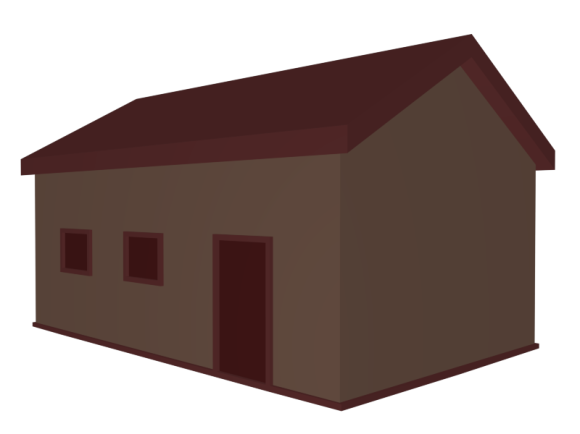
For cross-discipline I have made a logo for the student game Sellout. Sellout is a four person bank robbing game in which each player controls two gangsters with tommy guns. You can work with the other players to share the cash or double cross them to get more money. I have tried to capture the core elements in the game though the logo.
Erika's Uni Blog
DOCUMENTATION BLOG FOR STUDIO UNITS AND GAM110
Category Archives: Cross-Discipline
Handling Asset Data in Large Projects
As animators, we work with a large amount of data and a multitude of assets. Therefore it is essential that the asset data is handled correctly and organized well in large group projects. In this blog I will look at how I have handled this issue in the Rapid Reboot and Zurvivor projects, and how these methods can be improved for future projects.
Reboot Project
In the Rapid Reboot project we predominantly used Google Drive with communication over Slack. I initially set up this drive and created several different folders to help separate data.
 I find that this keeps everything neatly organized and helps when trying to find particular assets. Additionally, Luke established a naming convention that was successfully utilized throughout the project.
The naming convention was as follows:
Name_Asset_Detail
Examples:
 This helped us to easily see what had been done and who had done what.
Although the handling of asset data was relatively successful, there are several improvements that could have been made:
1. A detailed asset list.
Our project lacked any sort of asset list. We just kind of told each other what was needed. This was a very unorganised way to create assets. To rectify this we could have had a detailed asset list which outlined the required assets and who was creating said assets. The list should also include a progress tracker and update box. This would have allowed the team members to mark their progress off (e.g. “Unstarted”, “Draft Done”, “Final Done”) and allows managers to easily see where everyone is up to. An update box would allow team members others that a completed asset had been changed or modified (e.g. “Updated: Version 3”).
2. Version numbers.
This relates to the above mentioned update box. A version number should be incorporated into the naming convention in order to allow team members to easily see which the most recent version of a particular asset is:
Name_Asset_Detail_V01
This will also allow for roll back. For example, if Version 4 breaks and is completely unusable, the team can simply use Version 3 which works perfectly but is not as polished. This helps prevent a loss of data as early versions are always accessible.
Zurvivor
How we handled asset data in Zurvivor is very similar to the Rapid Reboot project. We use a well organized Google Drive and a naming convention. However, at the start of the project, Rowan created a detailed asset list:
 This was extremely helpful to the animators as it clearly showed what the asset was meant to be and what type of asset it is. From here I moved this information to an “Asset List and Delegation” sheet. Using what I had learned in the Reboot project, I added a progress marker, delegation section and update section.
 This has noticeably improved the workflow and has allowed Ben, Hamish and me to work quickly to finish assets.
Again, we haven’t yet incorporate version numbers. As these assets are for a game, they are either “Placeholder”, “First Pass”, “Second Pass”, and so on. So far this has been a sufficient replacement for version numbers. However, for larger, longer running projects I will definitely be utilizing a version system.
To the Future
For future projects I will using:
- Organized Google Drive
- Detailed asset list
- Progress marker and update box
- Naming convention
- Version numbers
These should allow for productive and efficient workflow.
Zurvivor: Placeholder Assets
For today’s playtest I made several placeholder assets. These assets were created according to the documented specifications. They are of the correct file size and resolution, follow the set out style and use the colours from the palette.
Zurvivor: Menu mock-up
For the Zurvivor game, I thought we could use realistic grungy textures, vignettes and possibly even film grain to create a gritty, tense atmosphere. To demonstrate this, I mocked-up the opening title screen. We could even add movement to the camera (make it see like it is swaying).
Zurvivor: Technical and Visual Guides
Currently, I am working on the Studio 2 trust game “Zurvivor”. The game is to be a four person, top-down, zombie survival game with 2D graphics. As we have lots of animators working on this project, I have put together some visual and technical guides to help with production. Hopefully these will speed our workflow and help us to maintain a consistent style.
Below is the initial style guide:
 Here are the colour palettes for the different sections:
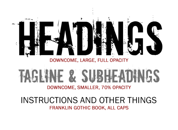 Finally, this is the technical specification guide. This guide covers the required file type, resolution and sizes. It also covers the relative scale and sizes of the different assets, with images that can be used as reference.
Games Collab: Trust
As part of the cross-discipline work, I will be collaborating with audio, animation and game students as part of the Studio 2 games project. On Wednesday we spent about 5 hours exploring the concept of trust (on which this project is based). The project seems really cool so far and I am looking forward to participating.
This Trimester, the games students must create a game that utilizes and explores themes of trust. The game will be presented and played in an exhibition space. This means that the players will not be able to communicate as they will be wearing headphones. In addition to these conditions, students from other disciplines (me included) are to contribute pieces of work (pictures, animations, ideas etc) which explore trust or a particular aesthetic. The games students then have to draw inspiration from these collected pieces and design a game based around them.
So far I have contributed the following ‘inspiration pieces’:
 From this the students could take: blind trust, lack of information, lying, vulnerability, colours, aesthetic or setting.
 From this the students could take: trade, betrayal, risks/gamble, lack of information, colours, aesthetic or setting.
 From this the students could take: blind trust, forced trust, vulnerability, obeying, colours, aesthetic or setting.
In addition to these pieces I came up with a weird game concept:
- Two player game sharing a single screen.
- Each player wears the old 3D glasses but with a single colour.
- Screen is monochromatic except for the playable characters and obstacles.
- Players will only be able to see the colour opposite to their glasses.
- Will have to work together in situations to get past obstacles but also have an individual score.
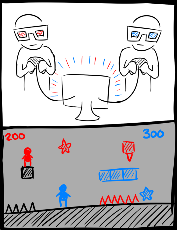 I know it sounds crazy but I think it will work. My friend is a programmer and had 3D glasses with just red in the lenses. He wore them while programming once (who knows why) and couldn’t work out why the program won’t build. He was using the dark skin for Visual Basic and couldn’t see part of his program (the thing that’s in red).
 I think it would be pretty cool and you could do really interesting things with it. It would just take some adjusting and making sure the colours had the same tonal values.
First Day Horrors: Animations and Post-Mortem
After Ben rigged the models I had created, I worked on the animation loops for the game. Below are videos of the animations of the game characters:
The animation is rough, especially the transitions. This is partly due to the time constraint. However, I really want to improve on the transitions and hope to do so in my animation specialization.
Post-Mortem
Overall, I am not happy with my work on this game. The designs were rushed, the models low-poly and ugly, no textures and very rough animation. All of this is partly due to the time constraint and partly due to the fact that I got sick in the middle of working on it.
The models are very basic and broke in some of the animations (monster’s legs and girl’s feet). I should have adjusted the design and the topography to fix these issues but I was running out of time.
In addition to this, something went wrong with the export (or possibly Unity) as Rowan could see the animations and play them in Unity but had trouble with putting them in the game. I am not sure what went wrong: I used 3DsMax to model and animate the characters and exported the models as FBX files with baked in animation.
Moving forward, I hope improve and resolve these issues through the animation specialization (game character). I plan to animate using Maya and will also do some research into more efficient game animation pipelines. In summary, this was not my best work but I has given me a new set of goals, new issues to solve and new things to research.
First Day Horrors: Models
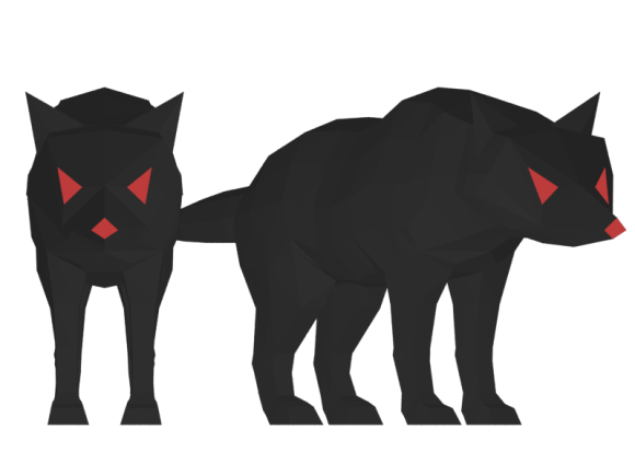
For my cross-discipline project I have created a bunch of models. Due to the time limit, the models are very basic and low poly. Also, I will be using the sub-object colouring inside 3DsMax as opposed to unwrapping and texturing each model.
First Day Horrors: Brief and Initial Concepts
So, I am taking on a second cross-discipline project: a 3D game for Studio 2 game students. The brief was to make a game that would, at first, scare the player and then make them happy through a surprise. The game I will be working on is titled ‘First Day Horrors’ and is about a young girl who must run through a monster-filled, dark forest to reach a golden gate. This gate turns out to be her school gate: she was safe all along and had just run out of class because she was anxious about her first day of school.
Here is the big twist: this game is due next Wednesday. So I will be working hard doing concepts, art, modelling and animation. I am not sure how much I will get done, but we will see.
To begin with I have started by doing some concepts for the characters and game space. The only source of light will be from the girl’s plush toy. It is for this reason that I have gone for a dark palette with a bright accent. And, obviously, the time limit means we will be going with a very simplified, low poly style.
Radial: Character and Narrative
David Whitehouse refined the narrative down to the following: “All the colour from Earth has disappeared due to the constellations disappearance. Causing the world to plunge into mono-coloured depression. So NASA has sent one man on a dangerous journey into space to reawaken the stars and revive the constellations.”
In light of this, I have refined my astronaut concept to make him have more of a proper spacesuit:
Radial: Title Concepts
The original opening / title screen for the game had a rotating I put this together as a concept for the title / opening screen of the game:
I liked this idea, however I also liked the idea of having the constellations textured to a sphere with its normal’s inversed. The titles (and camera) would float inside the sphere as it rotated, so that the constellations move in 3D space. I feel like this would look and feel more like the night sky. I mocked this up and the test of it is below:
I found that the second one is just not as clean. Also, I realised that I really liked the way that the constellations rotate around the letter ‘d’ in the original version.
I have tried to fix these issues in this final version, which uses the 3D textured sphere and incorporated 2D text over the render:
At this point in time I am really not sure if the 3D textured sphere is worth doing. The 2D version looks cleaner and if I really want the curvature / depth I can apply a ‘fish eye’ filter to the constellations.
Images used for constellation maps:
Constellations [Image]. (2013). Retrieved from
http://www.canstockphoto.de/photos-images/boreal.html#file_view.php?id=12361659
Skymap [Image]. (2010). Retrieved from
http://valarguild.org/varda/Tolkien/encyc/stars.html
Radial: Concepts
After discussing my initial concepts with the team, we have decided on the planet idea.
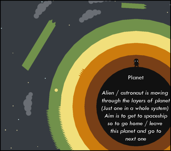 Using this concept, the player would be an astronaut or alien moving through the layers on different planets when they reach the outer layer they will either use a spaceship / rocket or gravity to get to the next planet. Below is my rough character concept for the astronaut.
Given its size on the screen, the character has to be quite simple. It must also use a very dark grey colour palette so as to contrast against the brightly coloured planets. Below is my concept of the planet selection screen (where the player can see all the planets, see how many collectibles they found and see the locked planets):
 David Whitehouse came up with the idea of setting the game in “inverted space”. Essentially its like regular space with inverted colours. This could be quite interesting and would work well with the dark astronaut suit:
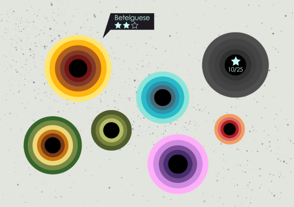 Obviously, I will need to adjust the colours to suit the lighter background. Ideally, we will have themed planets and a colour palette that matches each one.
To tie this all together I created a new concept that incorporates most aspects of the new design.
Initial Concepts for Radial
I really like the flat minimalist shapes and wanted to keep this aspect of the design. However, the colours and background decorations need to be changed to suit the narrative. My initial narrative and game concepts are below:
For the main character of the game, it must have a distinctive shape and be a mostly black silhouette in order to stand out against the different colours. In addition to this, all of the ‘dangers’ in the game are spiky and all the ‘good things’ are round. This is something that I have kept in mind when I work on the character design. Below are my initial sketches for the character:
The idea is that the character will be a 3D model with flat textures and shaders so as to look 2D.
Radial
I have began working on a cross-discipline game project with David Whitehouse. The project is called Radial and is a 2.5D game that we will be working to expand on and finish this Trimester. Currently, the game utilizes minimalist design and does not feature narrative. I will be working on the story, overall design and character animation.


