For the Deep Secret world builders project I created some initial concepts. Below is my first attempt at a ‘photo-bash’ concept for this project.
While this does kind of show the positioning of the props within the scene it is also very confusing. The photos I chose were from differing (and incorrect) perspectives which makes this concept very unclear.
To remedy this, I quickly coloured one of my thumbnails in the hope of making something more usable.
Again this does not display the correct perspective and gives no information about the details of path or the towers. So again, this was an entirely unusable concept.
I presented both of these concepts at the gallery walk and got a good amount of feedback on how to improve: in particular, I was told to focus on the perspective and give more detail to the path. While it was nerve-wracking to display concepts which I knew were ineffective, it was still a good experience and I have learnt a lot from it.
I have fixed up the last couple of issues with my game (exit button, reset button, horrible lighting and bloom) and have put a playable build up online.
I choose to integrate sound with my run animation inside the Unreal engine. I did this through the blueprint and notify systems. Firstly, I grabbed a couple of free sound effects and imported them into my project (quickly learning that a whole bunch of file types are not supported).
Then I dropped in some background ambience. This was very easy but required a blueprint setup because I wanted it to loop.
I then opened up my run animation, worked out where the sound should be played and set a ‘notify’ on the correct frame. This notify allowed me to attach a sound file (in this case a footstep) to the animation frame where she makes contact with the ground.
In addition to this, I added a gong sound effect to the beacons activating. This was a little more complicated and required using Blueprints (Unreal’s node based scripting) to get it working properly.
Finally, I made a musical sound play once all the beacons had been found. Again, this was much more complicated. Ben and I went through a couple of tutorials to work out how exactly that could be done.
The video below shows how the sounds work in the ‘game’.
These sound effects are not perfect at all but it does helps make the scene feel complete.
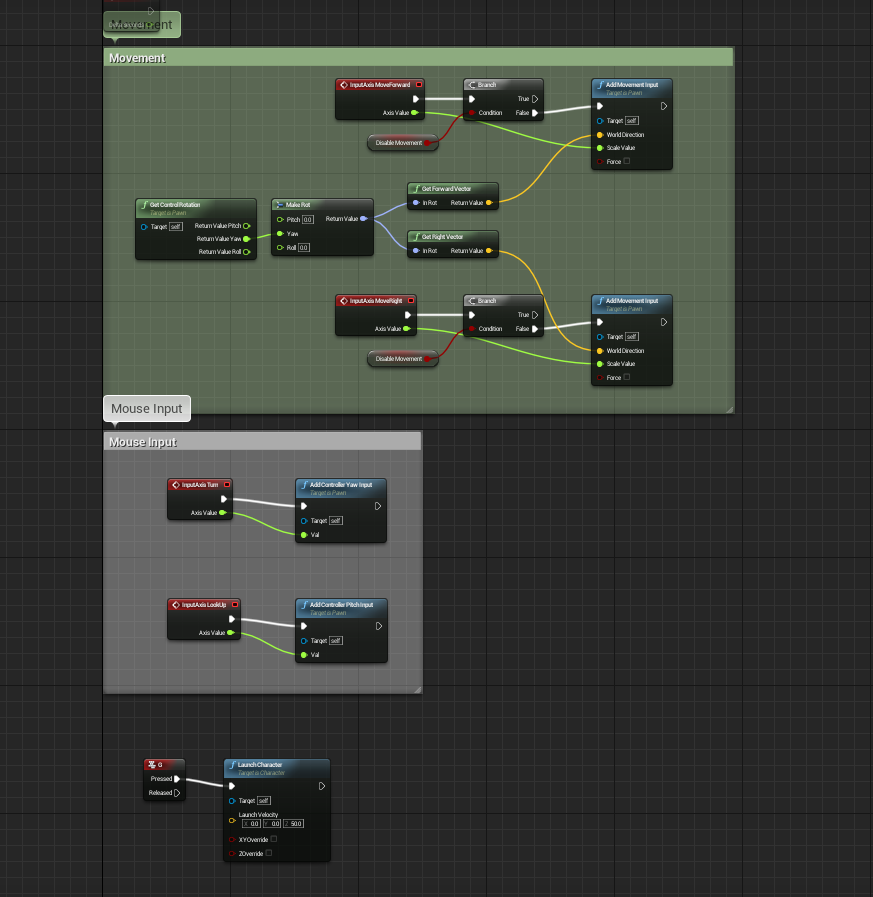
Having finally finished my character and created some very rough, very basic animations I began the process of setting everything up in Unreal. As I hope to work on games in the future, and because the game industry in Australia requires you to be an all-rounder, I decided to start from scratch and setup a character without using any of the templates. To do this I followed a comprehensive tutorial on the Unreal site.
The movement and control setup for my character
Through this tutorial I learnt how to set up a character, a camera, controls and animation using Blueprints (Unreal’s version of scripting). In hindsight I should have set up a different type of camera as the one I currently have highlights the lack of strafing animation. I did look into changing this but it required much more complicated Blueprint work and I currently lack the time to learn this.
The camera setup
The animation system is really cool and allows you to smoothly blend between different animations depending on the player’s speed or direction. As I just had a shitty idle animation and a basic run, my blend space was really simple.
The blend space between the idle and run
While this was all relatively straight forward it was time consuming and fiddly. For example, after everything was finally set up, my animations would not work. I checked and double checked everything but nothing fixed the issue. Finally I found a single node that had not been linked up.
Environment
Once I had a moving character, I decided to create an environment for her to move through. At first I planned to use just a basic plane but decided a small labyrinth would be much cooler. I quickly created a labyrinth in 3DsMax and imported into the game.
I then set about creating collision boxes for all the walls and the floor. This was quite fiddly and took some time as I had to individual place and size each collision box. Additionally, the camera seemed to interact weirdly with the collision boxes (like shaking when the player went to close to a wall).
Individually placed collision boxes (purple)
This was due to the collision boxes being slightly larger than the walls. I was then informed that, with a single click, you can use an objects faces as its collision boxes but it is much heavier when playing the game. As my game is very light to run, I decided to use this method. This basically fixed the issues with the camera.
Finally, I was able to run around the maze.
Interactables and Particles
At this point I decided that game was too empty and I needed something for players to interact with. Using the shapes (Unreal’s equivalent of primitives) I placed several pyramids around the maze as something for the player to find.
I wanted a glowy particle effect to be trigger when the player got close to the pyramid. To do this, I first created my own particle effect. Using the default fire as a base, I stripped out all the emitters except for the embers and tweaked the settings until I was happy with it.
Particle editor and viewport in Unreal
I then set up a collision box as a trigger around the pyramid. This was set it up so that once the player tripped the trigger the particles would activate and a sound of a gong would play.
Beacon with particles and collision box
Graphic User Interface (GUI)
Finally, I wanted to include some UI elements into the game to give it some sort of objective. This was done almost entirely through the blueprint system. Below is the final UI setup I have used in the game.
Firstly, I added a ‘counter’ that essentially counted how many beacons were active out of the total number of beacons. (The UI and interactables are set up in a way so that I can add more beacons and the UI and end state will adjust to suit). This required some complex blueprint work.
Then, with Ben’s help, I added some end game text. It simply says “All pyramids found!”. The trick was to have it hidden until the number of beacons activated matched the total number of beacons. Again, this was a little more complicated.
Lastly, I set up a timer so that the player can see how long it took them to complete the game. Once again I used blueprints to complete this.
Final Outcome
With all of these elements in, I had created an extremely basic game. It is not perfect and not even a vertical slice of a real game. However, I have achieved my goal: complete a game character production pipeline from design to implemention.
Below is a video of the gameplay as it currently is. I need to still add in a couple of things like a start menu, exit button and a skybox.
Through the course of my game character project I have kept the following technical specifications in mind so that my assets work efficiently in the Unreal game engine.
Polycount
Throughout my entire game character project I have been mindful of how my assets will import and run in a game engine. For this reason I have kept everything to a relatively low poly. My character is around 3000 polys which I should have reduced more, especially in the eyes and horns.
My environment (a quickly created labyrinth) was originally over 8000 polys which I managed to reduce to around 300 polys.
While the poly count is not going to be so critical in my mini demo/test it was good practice for the future as larger projects will require stricter poly counts.
The Importance of Resetting X-Forms
I had a couple of issues with importing my labyrinth file into the Unreal engine as I had forgotten to reset my X-forms. Once I had worked this out and fixed it everything went smoothly but it is something I will need to remember for the future.
Exporting and Importing FBX Files
Once my character was finished and had a basic run and idle animation I exported it into the Unreal engine. I did this by exporting the two animations as separate FBX files where the animation was baked in. This worked well when I imported the animations: when importing FBX files Unreal asks you if it is a skeletal mesh and, if so, does share a skeleton with one already in the project.
This allowed me to use the same skeleton for the run and idle animations which enabled me to create a blend space between the two.
Exporting and importing the labyrinth was even simpler as I exported as a FBX (with no animation) and imported it as a static mesh.
Iterative Files
The Unreal engine has the ability to update assets currently in the scene with a newly imported asset. All that is required is for it to have the same file name (you can also do it manually if you have differently named files). For this reason I kept a standard naming convention for my files allowing me to quickly and easily update my textures and animations.
So, after finishing the rig, I began the horrible next step: skinning. I hate skinning because it is fiddly, tedious and never seems to work for me.
However, Steve told me about the Geodesic Voxel Binding and Heatmap tools in 3DsMax 2016. These tools are not included in the main download of Max but you can get them if you install the Service Package 1 and then Extension 1.
The Geodesic voxel binding is magic and literally saved me an hour or so of correcting vertex weights. It is included inside the Skin modifier. That is, you simply add a Skin modifier and add the bones (as you normally would). With no settings adjusted, the modifier will attempt to mold the mesh to the bones but is usually very inaccurate.
To use the Geodesic voxel binding you scroll down to Weight Properties, select Voxel and click the little “…” box on the right. Another dialogue box should appear. With this you can control the falloff of the binding and the maximum number of bones that can have an influence on any given vertex (if you leave it as 0 the program will work out if out for you). You can also just the “accuracy” of the binding, 64 being the lowest.
I tested this on my model with the default settings at the lowest resolution.
As you can see it has already fixed one of the biggest issues. Of course, it still needs much adjusting. I fiddled around with the voxel binding settings until I found something that worked and applied that to my model at a high resolution. From there I adjusted the individual vertex weights in the problem areas until I had fixed all the issues.
Below is a short video of my skinned model:
After uploading this, I noticed an issue with the belt and the hip moving inwards and clipping through the body. I have since fixed these problems.
For cross-discipline I have made a logo for the student game Sellout. Sellout is a four person bank robbing game in which each player controls two gangsters with tommy guns. You can work with the other players to share the cash or double cross them to get more money. I have tried to capture the core elements in the game though the logo.
I am continuing to work through the production pipeline of creating a game character. Having finished the modelling stage, I moved onto the next step: rigging.
Initially I had hoped to create a skeleton in Maya and then create a rig. However, as I have not used Maya before, this proved extremely difficult, frustrating and I was running out of time. So, in order to be able to finish this pipeline this Trimester, I have instead created a custom CAT in 3DsMax. This was much more efficient as I have worked with CAT rigs before.
I began by adding a CAT parent.Then I added a hub bone (the pelvis) and some legs. The CAT system is really effective because if you create one leg in full you can simply copy and “paste mirror” for the other leg.
I then continued to add bones for the rest of the body. Including all the finger bones and an additional bone for her bag. I made sure to colour the bones in a way that makes it easy to see what is what: the left side is pink, right side is green, central bones are blue and the bag is yellow.
From here, I added up-nodes, gizmos and IK targets to allow for easy animation. Again, I made sure to keep the same colour system. I like to make sure that the controllers are larger than the model, so that there will be no issues when animating (such as being unable to find a finger gizmo).
I created extra gizmos around the knee and elbow up-nodes, so they are easy to see and grab. Additionally, I used squares for the knees and circles for the elbows, as I have had issues in the past when they get mixed up.
I added text to the hand IK targets and made them slightly brighter shades of green and pink so that they are easy to find and use.
Finally, I added a rectangle gizmo to the shoulders. These will help to see what position the shoulders are current in (as horizontal is the neutral or starting position).
Finally, my custom, animation-friendly rig is finished and ready for me to use.
The history of video game graphics is relatively short spanning just 57 years (Brown, 2015). In the eyes of film or photography, games are still in their infancy. However, video games have dramatically developed in this short amount of time both graphically and as a form of entertainment.
They have developed from simple mechanics displayed with moving light…
Tennis For Two, heralded as the grandfather of video games, was developed in 1958 on an analogue computer using a cathode-ray tube and oscilloscope to display the game.
…to photorealistic 3D characters and worlds.
Hellblade, currently still in development, uses detailed 3D scanning in combination with modelling and texturing to create realistic graphics.
Because of the medium itself, video game art is constrained by graphical capacity and hardware limitations. Due to this, game art tends to change and adapt with technological advancements. However, some styles maintain popularity over time.
Rogue Legacy (2013) utilises 2D pixel sprites in a randomly generated play space.
To see how video game art has adapted and changed over time, and how this influences current practices, we must go back to the beginning.
IN THE BEGINNING…
In the early days of video games, the graphics were extremely limited. During the early 1970’s, games were limited to simple shapes and a polar palette of black and white (Brown, 2015; C.L., 2011).
Pong (1972) is a famous example of this.
The ‘art’ was merely a representation of the vague narrative given to the game’s mechanics. In this sense, game art of this era was about maximum communication with minimum graphics.
Space Invaders (1978) uses slightly more complicated images.
The limitations of black and white prevented detailed game art at this time. It wasn’t till the late 70’s that development of arcade hardware allowed for colour (Brown, 2015; C.L., 2011).
Although not the first, Galaxian (1979) was considered the first successful game to use colour.
This allowed for multi-coloured sprites, providing artists with a larger range of tools and allowing for more detailed games. By the 1980’s, coloured pixel graphics were considered the norm (Brown, 2015). Although vector graphics were used for some games, the ability of pixels to render complex scenes with detailed, filled shapes secured their dominance (Brown, 2015).
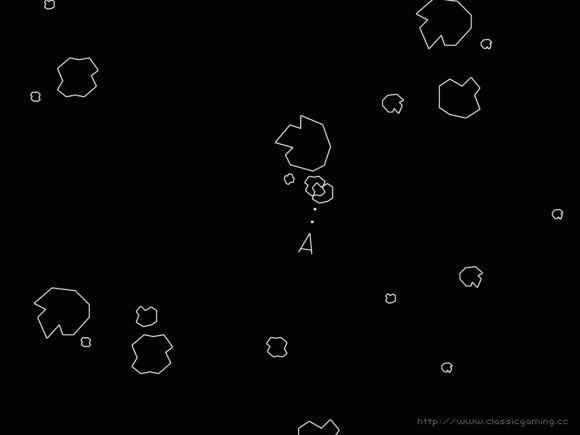
Asteroids (1979) is probably the most famous vector graphics game.
During the 80’s, the majority of video games were using 2D coloured sprites to depict characters and enemies (Brown, 2015). As the hardware developed beyond 8-bit, so too did the complexity of the graphics. However, game art was still about working with or around the limitations of the hardware to convey enough information to the player (Brown, 2015). Due to this, characters were created with simple, bold designs and limited movement (Cobbett,2009). Characters often had only a few sets of animation with little to no follow through or anticipation.
Mario (1985) famously wears a hair because his hair was too hard to animate.
Over the course of the 80’s, more colours became available to artists and sprites became more detailed and complex (C.L., 2011). As hardware capabilities increased, games were able to have more detailed environments and backgrounds (Brown, 2015). This allowed artists to develop complete worlds with distinct aesthetics.
Golden Axe (1989) featured detailed characters and environments with an isometric view, allowing the player to move in four directions.
Towards the end of the 80’s and, through the early 90’s, some developers began the awkward transition into 3D graphics. In these early days, 3D graphics were limited to wireframe rendering (Corbett, 2009). Much like the early days of game, artists were forced to reduce complexity and favour communication through simple forms.
Elite (1984) is considered a pioneer of 3D with its wireframe visuals.
Graphic capability eventually improved beyond wireframe, allowing 3D models to have flat shading, but it was considered ugly compared to the detailed 2D graphics at the time.
With stunning graphics, detailed characters and a wide variety of animation, Street Fighter II (1991) still holds up today and secured the ongoing popularity of 2D fighting games.
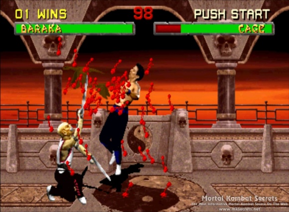
Similarly, during the 90’s, 2D games were experimenting with multimedia technology like digitised sprites and full motion video (Corbett, 2009). Digitised sprites were considered a new wave by some and became popular thanks to games like Mortal Kombat (Brown, 2015). However, full motion video, due to compression and resolution limitations, was quickly dropped.
Mortal Kombat (1992) featured ‘realistic’ graphics and gore, causing the controversy that lead to its success.
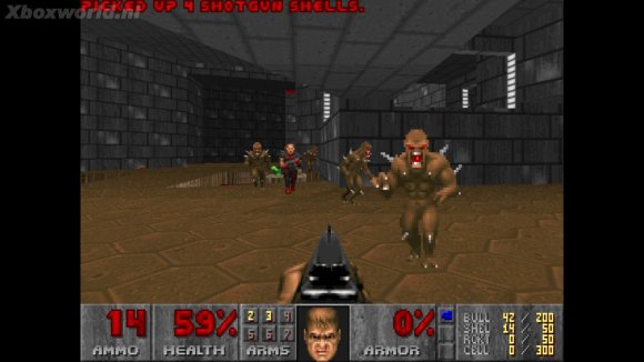
Despite its general ugliness, 3D was quickly becoming popular but the hardware was not up to scratch (Brown, 2015). To compensate, many games incorporated 2D sprites in a 3D world.
With a 3D environment, 3D lighting and 2D sprites, Doom (1993) was extremely impressive at the time and paved the way for first-person shooters as we know them.
This paved the way for the next era of game art.
TRUE 3D
From the mid to late 90’s, hardware developed enough to allow fully 3D games to be developed. This provided another change and challenge for artists: the characters, animations and environments must look good from all angles and in extremely low poly (Brown, 2015).
Mario 64 (1996) maintains a pleasing aesthetic and considered a pioneer of true 3D.
Another consideration that artists and animators had to make, was the reaction and speed of the animations (Brown, 2015). As fast-paced first person shooters rose in popularity, consumers were expecting believable yet fast actions. Artists had to compensate believability and anticipation for reactivity of animations.
Heralded as the first true 3D first person shooter Quake, (1996), was critically acclaimed at the time.
As 3D games became dominant, two distinct streams emerged: realistic and stylised (Brown, 2015).
REALISM VS. STYLISED
Regardless of aesthetic, realism is often toted as the best (Brown, 2015). This is not always true. In fact, when looking back at older games, those with ‘realistic’ graphics (at the time) feel outdated and often fall into the uncanny valley.
Seaman (1999) is a virtual pet game and potentially the creepiest game known to man.
In reaction to this, a lot of games were created with stylised graphics. This was often done through use of cell shading and stylised or ‘cartoony’ characters.
Jet Set Radio (2000) used cell shading and bright colours to create a stylised aesthetic.
Currently, we can produce extreme realism in terms of visuals, lighting and physics.
The latest Tomb Raider (2015) features realistic hair simulation rendered in real-time.
While video game art is still bound by graphical and hardware limitations, it is no longer forced to have maximum communication for minimum visuals (Corbett, 2009).
CURRENT PRACTICES: REALISM
So how does this long, detailed and well researched history influence the current practices for creating realistic video game art?
Well, as mentioned before, video games do not have the same limitations that they once had. For realistic games, we face a new issue. Games need to feel realistic: players will expect everything from reload animations, dynamic grass simulation and varied action, hit and death animations. Additionally, they will want reactivity and speed, which sometimes opposes the realism.
Assassin’s Creed games are renowned for detailed and varied parkour movement.
While this is achievable it might be well out of scope, forcing the artists and developers to find ways to cheat or work around this. This has changed the way the art and animation is created within the industry.
One method that artists use to create diverse environments quickly and efficiently, is through modular development of assets:
In order to achieve ‘true realism’ many companies have begun using motion capture as a more efficient way to get realistic animation (Dahl, 2015).
Motion capture for The Last of Us (2013).
And even facial motion capture for subtle expressions.
Other methods, such as digital scanning, are being used to achieve photo realistic 3D models (Ninja Theory, 2015).
Body scan for Hellblade (still in development).
While polygon count is still an issue, it is no longer the major limiting factor. Models too detailed to be featured in the game can be baked out at a normal map and projected onto a lower poly model (Ward, 2013).
Additionally, extreme texture detail can be achieved with the help of software such as the Quixel Suite.
The development of realistic games is always tied to technology and will continue to be so. The future of game art will depend on the next leap or trend of video games themselves.
CURRENT PRACTICES: STYLISED
Many current games are preferring to employ a stylised aesthetic. This might be due to a multitude of factors:
To avoid the bleeding edge and eventual aging of realism
To be able to run on portable devices such as mobile
To stay within a smaller, indie budget
To have a particular art style
Because it suits the game better
The current popularity in indie or ‘retro-like’ games has seen a rise in 2D stylised graphics.
VVVVV (2010) is a critically acclaimed pixel puzzle platformer.
Current technology allows these sorts of games to run a lighting fast speeds. Thus giving them a competitive edge on their realistic peers.
Skullgirls (2012), a fast-paced fighting game, uses beautiful, 2D animation.
Additionally, lessons from the history of games allow these to be created with a high degree of fidelity and a modern understanding of game design (Brown, 2015).
FEZ (2012) allows players to move in 3D with a ‘2D’ pixel aesthetic.
Similarly, some games break the mould and experiment with new forms of stylisation.
Called ‘1-Bit’ or ‘dither-punk’, Return to the Obra Dinn (in development) returns to a monochromatic style with 3D graphics.
This is an exciting era of video games. The indie development scene currently gains as much attention as AAA titles and there is a balance between realistic and stylised games.
I don’t know where video game art with venture to next but I am happy to be along for the journey.
According to psychological market research, colour can account for up to 60% of the acceptance or rejection of a product (Kissmetrics, 2015). In the same way, a character or scene will look thrown together or implausible if colour is not carefully considered throughout the design process. This is because colour greatly contributes to the mood and story of a piece (Price, 2014). If compelling and meaningful choices are made, colour can be used to imply a characters personality or role within the story (Diaz, 2011). To use colour effectively, we must first understand basic colour theory, the different attributes of colour and to use them harmoniously.
BASIC COLOUR OVERVIEW
Basically, all colours originate from the three primary hues: yellow, blue and red (Lovett, 1999).
Secondary colours are created by mixing two adjoining primary hues and tertiary colours are created by mixing two adjoining secondary hues (Lovett, 1999). Compound colours are mixtures of the three primary hues (browns and khakis) (Lovett, 1999).
While this is important for blending colours, even more important is understanding the different attributes of colour and how they can be used to achieve a mood, focal point or atmosphere.
THE ATTRIBUTES OF COLOUR
Hue
This is the identity of a colour separate from its saturation or value. The hue establishes whether the colour is blue, orange, green-yellow etc (CGCookie, 2013).
Saturation and Value
Every colour has a hue, saturation and value. Saturation refers to the intensity of a colour while value refers to how light or dark it is (Price, 2014). These can be used to guide the viewer, set the mood and tell a story.
Most commonly, saturation and value can be used to create a focal point. For example, areas of high saturation draw the eye (Price, 2014). This technique is used a lot in fashion photography. As seen below, the focal point is the bright lipstick.
Similarly, areas of high value contrast, that is a difference of light and dark values, become the focal point (Lovett, 1998). For example, in Howard Pyle’s Marooned, the contrast between the bright sky and the darkened figure of the pirate make him the focus point of the piece.
However, it is important not to overdo saturation or value. High saturation and high value contrast should be used sparingly on selected focus points. Too many saturated colours gives no focal point and becomes confusing and ugly (Price, 2014). Some cartoons or animations try to use this as a style but it can look garish.
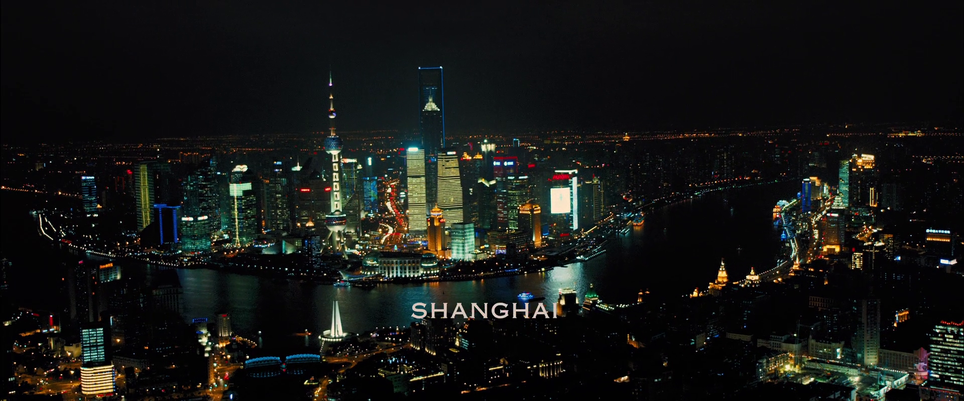
Additionally, saturation can be used to influence the mood of a piece. High saturation gives a vibrant and joyous feel while desaturated colours feel serious, dull, old and sad (Price, 214). For example, the first shot of Shanghai in Skyfall is bright and vibrant suggesting opportunity and adventure.
While the first shot of Skyfall is desaturated and dull symbolising the old memories and ghosts the James Bond associates with the estate.
But how can we use this in character design?
In terms of saturation we can try to explore the characters personality. In Edward Scissorhands, Kim wears bright colours to show her vibrant, outgoing personality while Edward wears tones and even has pale makeup to demonstrate his more reserved and serious personality.
Alternatively, we could use saturation to direct of the eye of the viewer. Lilith, from Borderlands 2, wears slightly desaturated colours while her bright red hair is quite saturated. This creates a focal point on her face which her hair so nicely frames.
According to Diaz (2011) main characters should have values that make them distinctive, even in black and white. Looking at Spike from Cowboy Bebop, consider how the contrast of the yellow shirt and dark blue jacket catches the eye. This effectively frames his face, thus making it the focal point.
Temperature
When looking at the colour wheel, we can cut it in half. On one side are the cool hues, on the other are the warm hues. A colour’s temperature is measured in degrees Kelvin (K) but this is more important for editing photos than for design.
Cooler colours give an introspective vibe (Diaz, 2011). They tend to be calm, calculating and soothing and will often receded into a scene (CGCookie, 2013). In contrast to this, warm colours have an energetic feel (Diaz, 2011). They tend to feel brighter and more vibrant and will often ‘pop’ out of a scene (CGCookie, 2013).
With this in mind, temperature can be effectively used to convey a character’s personality. Consider Miguel and Tulio from The Road to El Dorado.
Miguel has a warm colour palette reflecting his optimistic, outgoing personality while Tulio has a cool palette reflecting his calculating, more cynical personality.
For design, using a harmony of both cool and warm colours is highly effective (CGCookie, 2013). However, combining excessive amounts of both can make the design seem busy, chaotic and ugly (Kissmetrics, 2015). For this reason, it is good idea to pick a dominant temperature and use the other temperature as a highlight (CGCookie, 2013). For example, in a predominantly cool design, a warm colour will pop out and vice versa. This can be used to great effect when designing both characters and scenes.
For example, Aang, from Avatar: The Last Airbender, is composed of warm colours with the cool highlight of his arrow tattoo.
The warm colours reflect his sunny, outgoing personality and make the blue tattoo stand out even more. You can’t help but to notice it thus constantly reminding the viewers that Aang is the Avatar (as signified by these tattoos).
In addition to this, Aang is the only character that has a combination of cool and warm colours (other characters have only one or the other). This again makes him stand out against the rest of the cast and positions him as the main character. Not to mention that, in the beginning of the series, the secondary characters wear cool colours to provide even more of a contrast.
COLOUR HARMONY
Colour schemes are different ways to harmony between colours within a piece. Different schemes and different levels of harmony can create different moods or feelings. Extreme harmony can make an image seem boring or flat while no harmony can seem chaotic and messy (Morton, 2015). A couple of basic schemes are explained below:
Monochromatic
A single hue is used while the value and saturation is varied (Price, 2014).
Analogous
Three adjacent hues (Morton, 2015). As this is frequently seen in nature, this scheme is harmonious and pleasing to the eye (Kissmetrics, 2015). It appears natural, serene and comforting (Price, 2014).
Complementary
Two hues on opposite sides of the wheel (Morton, 2015). As this creates maximum contrast is it good to use one as the dominant colour and the other for splashes or highlights (Kissmetrics, 2015; Price, 2014).
Split Complementary
A variation of the complementary scheme (Price, 2014). Uses the two hues adjacent to one of the complementary hues (Kissmetrics, 2015). Again, this scheme has a high degree of contrast but is not as drastic as the complementary scheme. This scheme creates a joyous mood (Price, 2014).
Triadic
A triangle of hues. This is hard to do well and can seem childish. If all three are used in equal amounts it will look chaotic and ugly (Price, 2014). It’s best to use one as a background and the others as highlights (Kissmetrics, 2015).
Tetradic
Also called rectangle, two sets of complementary pairs (Kissmetrics). Again, equal amounts of each will be chaotic. Works best when one pair is used for the foreground and the other for the background (Price, 2014). Warm and cool hues need to be balanced well.
From Nature
Nature has an abundance of unique and interesting colour schemes that might not fall into the traditional schemes or rules (Morton, 2015). Have a look around and see if you can find something that captures the mood or feel that you need.
The colours of this Nudibrach could work well for cyberpunk / hacker story.
The colours of this Mantis Shrimp could work well for acid trip or similar.
REMEMBER THAT COLOUR REACTS TO ITS SURROUNDINGS. IT WILL BEHAVE DIFFERENTLY IN RELATION TO OTHER COLOURS SO IT IS IMPORTANT TO EXPERIMENT.
FINAL CONSIDERATIONS
When designing a scene or character it is important to understand what you want before you begin choosing colours. You must consider what you are trying to say or convey about the character. Remember characters don’t exist in a vacuum, they live in a world or environment. Consider the colours around them and what it says.
Do they fit in?
Earthy tones in both character and scene design suggest that he belongs.
Or do they stand out?
Contrast between bright colours and dark tones suggests he doesn’t fit in.
Think about how you will demonstrate this through hue, saturation, value and harmony.
Additionally, if a character appears in a single environment it is important that they work well in that one environment (Diaz, 2011). While a character that is in multiple environments must be able to work in all of them.
Neutral colours help the more action orientated characters from Firefly blend into every environment. This makes them seem competent in every situation.
Finally, don’t overdo it. Colour can be used subtly to great effect. Think about interesting ways that you can incorporate colour and what it can say about your characters and world.
Over the last couple of weeks, everyone in the digital painting specialization has been actively using Slack to share designs and give feedback. In addition to this, Katie has been holding feedback sessions during class. This has all been helping to develop my character design.
In the first session, we looked at this concept:
From this session the feedback was:
She is unbalanced – needs something on the feet or legs
The thread looks messy and out of place
Cloak doesn’t fit well with the rest
Include more of Norse pattern
Change physique: make her more demi-god like
Using this feedback, I tweaked her design. In these iterations, I tried to balance the design more and have more repetition of the certain elements like the runes and black crosses.
In the second feedback session we reviewed the bottom left iteration. The feedback is as follows:
In addition to this, it was suggested that, for the feathers, I start with a black base and add purple slowly. I also think the purple was a bit much but I will definitely work it into the feathers.
From here, I tweaked her design again, fixing up the leg wraps, cloak, runes and adding raven feathers:
I posted this iteration on Slack. Jo pointed out that we should be able to see the back of the skirt. Both Vanja and Chris suggested that I make her much taller. Again I applied this feedback:
In response to this image, Chris said that I could make her even taller (around 9 heads tall). He suggested that I look at Wonder Woman and fashion sketches as reference.
From here I will try to exaggerate her height even more. I think I have been playing it safe so far, so I will do several tests really trying to exaggerate the proportions. Additionally, I will also begin to test colours for her clothing and working purple into the feathers.
As animators, we work with a large amount of data and a multitude of assets. Therefore it is essential that the asset data is handled correctly and organized well in large group projects. In this blog I will look at how I have handled this issue in the Rapid Reboot and Zurvivor projects, and how these methods can be improved for future projects.
Reboot Project
In the Rapid Reboot project we predominantly used Google Drive with communication over Slack. I initially set up this drive and created several different folders to help separate data.
I find that this keeps everything neatly organized and helps when trying to find particular assets. Additionally, Luke established a naming convention that was successfully utilized throughout the project.
The naming convention was as follows:
Name_Asset_Detail
Examples:
This helped us to easily see what had been done and who had done what.
Although the handling of asset data was relatively successful, there are several improvements that could have been made:
1. A detailed asset list.
Our project lacked any sort of asset list. We just kind of told each other what was needed. This was a very unorganised way to create assets. To rectify this we could have had a detailed asset list which outlined the required assets and who was creating said assets. The list should also include a progress tracker and update box. This would have allowed the team members to mark their progress off (e.g. “Unstarted”, “Draft Done”, “Final Done”) and allows managers to easily see where everyone is up to. An update box would allow team members others that a completed asset had been changed or modified (e.g. “Updated: Version 3”).
2. Version numbers.
This relates to the above mentioned update box. A version number should be incorporated into the naming convention in order to allow team members to easily see which the most recent version of a particular asset is:
Name_Asset_Detail_V01
This will also allow for roll back. For example, if Version 4 breaks and is completely unusable, the team can simply use Version 3 which works perfectly but is not as polished. This helps prevent a loss of data as early versions are always accessible.
Zurvivor
How we handled asset data in Zurvivor is very similar to the Rapid Reboot project. We use a well organized Google Drive and a naming convention. However, at the start of the project, Rowan created a detailed asset list:
This was extremely helpful to the animators as it clearly showed what the asset was meant to be and what type of asset it is. From here I moved this information to an “Asset List and Delegation” sheet. Using what I had learned in the Reboot project, I added a progress marker, delegation section and update section.
This has noticeably improved the workflow and has allowed Ben, Hamish and me to work quickly to finish assets.
Again, we haven’t yet incorporate version numbers. As these assets are for a game, they are either “Placeholder”, “First Pass”, “Second Pass”, and so on. So far this has been a sufficient replacement for version numbers. However, for larger, longer running projects I will definitely be utilizing a version system.
To the Future
For future projects I will using:
Organized Google Drive
Detailed asset list
Progress marker and update box
Naming convention
Version numbers
These should allow for productive and efficient workflow.
For today’s playtest I made several placeholder assets. These assets were created according to the documented specifications. They are of the correct file size and resolution, follow the set out style and use the colours from the palette.
I had previously created the hair for my character out of splines and a hair modifier. However, this was not working so well and it would not export to Maya (or Unreal). So I redid her hair in polygons.
This was done very quickly and is quite basic. I would love to have time to fix this but I really don’t think I will be able to. However, it is working at the moment.
I have created a set of initial textures for my character. This is basically a draft that will help me to place the lines / paint later on. Hopefully, if I have enough time this trimester, I will iterate on it to get a painterly style.
Using the list of assets that Rowan created, I made a new asset list that will allow the animators to delegate the tasks, prioritize and check our progress.
For the Zurvivor game, I thought we could use realistic grungy textures, vignettes and possibly even film grain to create a gritty, tense atmosphere. To demonstrate this, I mocked-up the opening title screen. We could even add movement to the camera (make it see like it is swaying).
Currently, I am working on the Studio 2 trust game “Zurvivor”. The game is to be a four person, top-down, zombie survival game with 2D graphics. As we have lots of animators working on this project, I have put together some visual and technical guides to help with production. Hopefully these will speed our workflow and help us to maintain a consistent style.
Below is the initial style guide:
Here are the colour palettes for the different sections:
Here is the font guide:
Finally, this is the technical specification guide. This guide covers the required file type, resolution and sizes. It also covers the relative scale and sizes of the different assets, with images that can be used as reference.
Below is the final character design with details and colour palette:
I will be using this as a reference when I begin to texture my model properly. I chose a earthy, forest colour palette and gave her some tattoos to add a bit of detail to the model.